Ikke bruk. Denne er utdatert. Ny kommer snart.
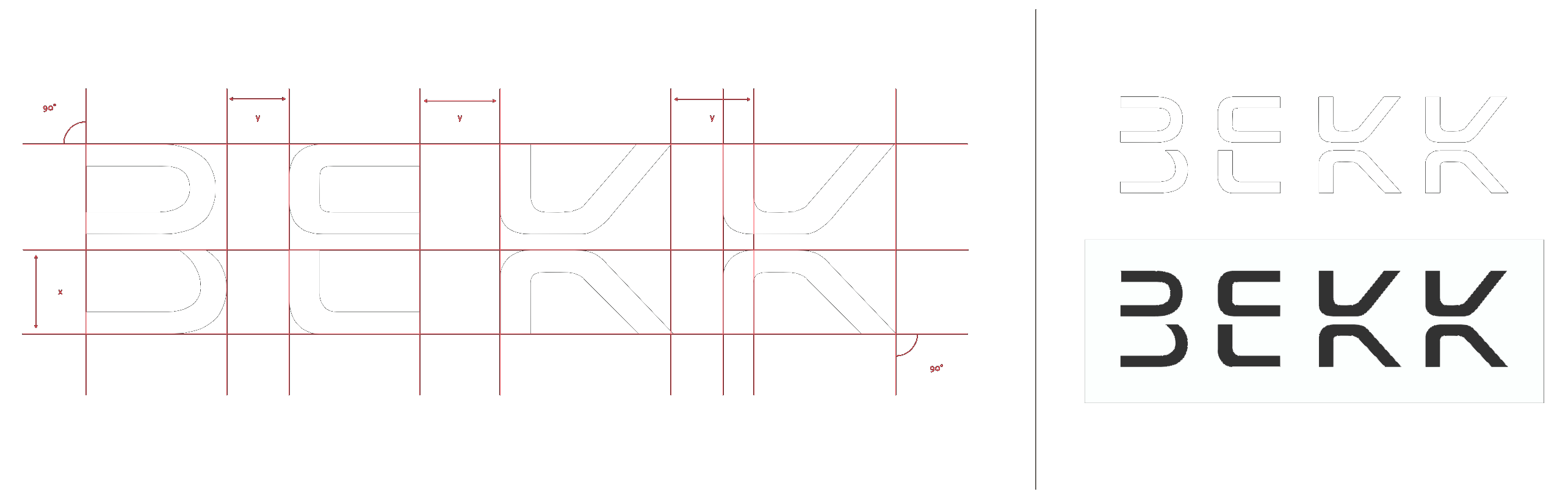
BEKK logo should only be used in white on black or black on white. Alternatively silver foil Luxor 377 for print.
Logo size
Logo size should be used in small size to create exclusivity.
IKKE bruk. Denne er utdatert. Ny kommer snart.
The color palette contains 9 colors. These colors are supposed to be composed using two colors of a group, primarily light tones (pink / green - pink / blue - green / blue)
Light tones
The group consisting of bright tones should used where there are solid colors (no gradients). These are the main colors and should be used where there are no opportunity, nor appropriate, for gradient between the colors.
If you want to use these colors in the logo without gradient, use the light or the dark tones.
Midtones
These are intended as additional colors and will be used on graphical elements along with the other color groups. This color group should not be used in the logo.
Dark tones
This color group should be used together with the light color group to create gradients.
Resources
Download swatches-
BEKK red
...
Pantone RED 032 U
- C
- M
- Y
- K
- 0
- 0
- 84
- 59
- R
- G
- B
- 253
- 80
- 88
- H
- E
- X
#FD5158
-
Bekk Yellow
...
Pantone 601 U
- C
- M
- Y
- K
- 0
- 0
- 40
- 0
- R
- G
- B
- 54
- 189
- 178
- H
- E
- X
#FFF9AE
-
BEKK green
...
Pantone 3265 U
- C
- M
- Y
- K
- 69
- 0
- 37
- 0
- R
- G
- B
- 255
- 249
- 174
- H
- E
- X
#36BDB2
-
BEKK Dark
...
Black
- C
- M
- Y
- K
- 20
- 20
- 20
- 100
- R
- G
- B
- 30
- 30
- 30
- H
- E
- X
#1A1A1A
-
White
...
White / Paper
- C
- M
- Y
- K
- 0
- 0
- 0
- 0
- R
- G
- B
- 255
- 255
- 255
- H
- E
- X
#FFFFFF
-
Dark 1
...
Pantone 402 UU
- C
- M
- Y
- K
- 0
- 6
- 14
- 31
- R
- G
- B
- 187
- 176
- 163
- H
- E
- X
#BBB0A3
-
Dark 2
...
Pantone 404 U
- C
- M
- Y
- K
- 0
- 8
- 22
- 56
- R
- G
- B
- 136
- 126
- 111
- H
- E
- X
#887E6F
Usage
The profile is characterized by its heavy use of graphical elements. Illustrations uses abstract forms containing two colors, or gradients of these colors, from the color groups light and dark tones.
If not possible, use a single color from either light or medium tones.
The profile the font called Fedra and will be used on all printed media without exception. In headings shall the font be weighted. for body text it should be (book).
For web
Areal should be FS Joey"s substitutes on the web and other digital surfaces where it is not possible to use (Joey).
Fedra has a large font family. Consistency and strength in its geometric design makes Joey"s clear in its expression and is very distinctive. Simultaneously it provides an incredible relaxed feeling, are friendly and energetic.
- Conduit ITC Light 30, Lineheight 1,2em
- Color: #EBEBEB
h1. heading
- FedraSerifB Book 34, Lineheight 1,2em
- Color: #EBEBEB
h2. heading
- FedraSerifB Book 24, Lineheight 1,2em
- Color: #1A1A1A
Standard
- FedraSerifB Book 16, Lineheight 1,5em
- Color: #C6C8CA
Ingress
- FedraSerifB Medium 16, Lineheight 1,5em
- Color: #1A1A1A
Person name
- FedraSerifB Book 16, Uppercase
- Color: #EBEBEB
Meta
- Conduit ITC Light 14, Letter Spacing 1.2
- Color: #EBEBEB & #C6C6C6
Menu heading
- Conduit ITC Light 18
- Color: #EBEBEB
Images used in works related to BEKK should be retrieved from the image library. All images must be used according to the library.
The base CSS file contains all the default setup for an internal BEKK webpage. In this package you may find the grids, components (like buttons i.e.), colors, typography setup and more.
Use the button classes on an <a>, <button>, or <input> element.
Active / rollover state
Buttons will appear pressed when active.
Disabled state
Makes buttons unclickable.
These are exampels on how profile pictures are displayed in the internal systems.
These anchor tags are part of the dark theme. They will work as intended on all anchor tags without having to assign any extra styles.
Basic forms
The individual form elements automatically receives global styling. Wrap all form elements inside .form-group for best possible compositions of the elements.
Example
This section will exemplify illustrations and graphical elements, and suggest methods for realizing them using HTML and CSS.
Circular shapes and images
Images are often presented with a circular shape to give the effect of a peephole. Images from our library should be used when used in a "BEKK context".
Example
Awesome!
These elements are used in the internal systems. Use them for inspiration.
Feedback widget
...
Example
News Element
...
Widget: CV-kort
...